
Can you picture the last cover that made you pick up a book? Even without reading the jacket, there’s plenty to be gleaned from this approximately 6-by-9-inch space. There’s the splashy neon type of a thriller, archival paintings that frequently cover novels by literary It girls, and, well, evocative illustrations on the front of nearly every romance.
These days, however, cover designers are also facing unprecedented pressures. Purchasing has largely moved online to retailers like Amazon, posing challenges for those looking to grab attention at the speed of a scroll. Budgets have been slashed. Most importantly, there’s a growing resistance to experimentation, leaving entire book displays covered with the same ubiquitous, blobby swaths of color. (Internet observers have come to refer to it as “the book blob.”)
To discuss the thrills and challenges of this highly visible but often overlooked job, CULTURED gathered three leading practitioners—Sandra Chiu, Chip Kidd, and Rodrigo Corral—for a candid roundtable discussion.
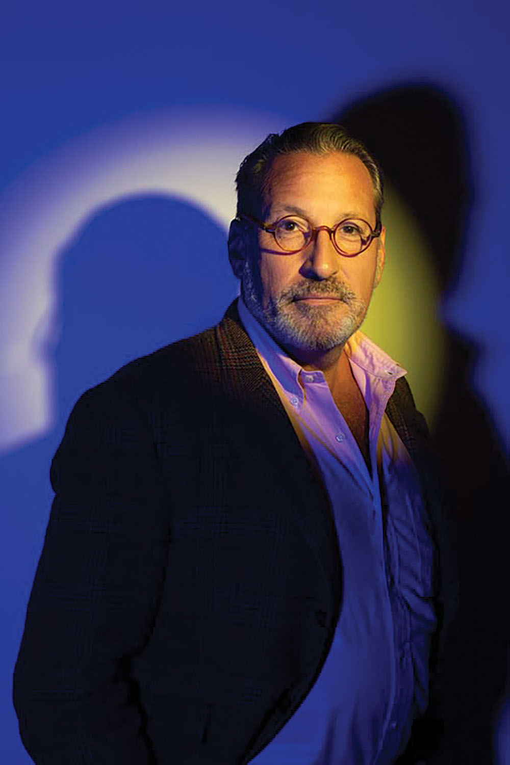
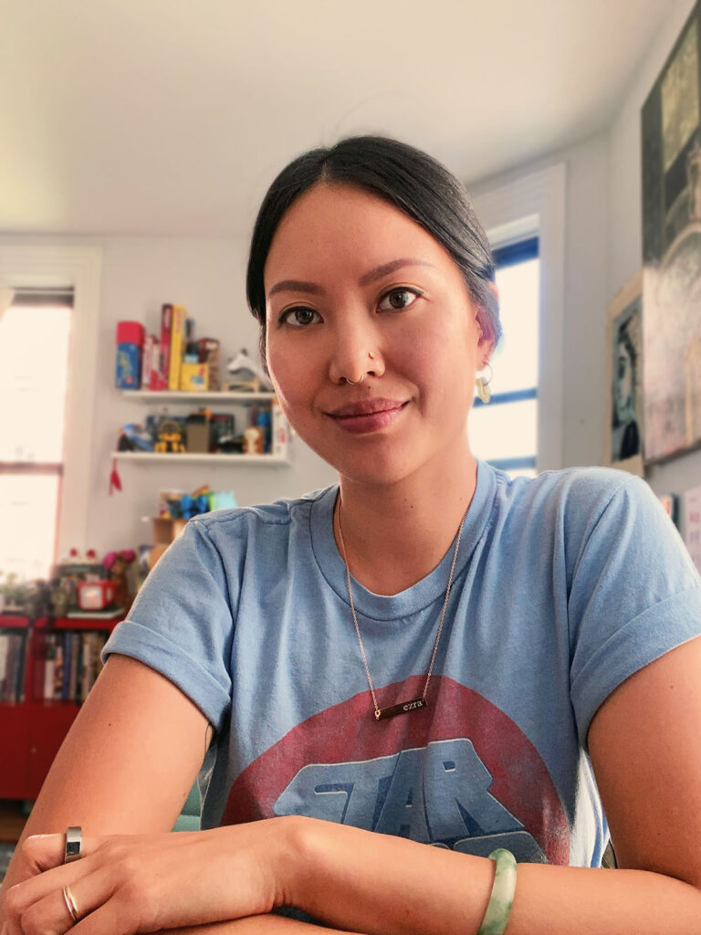
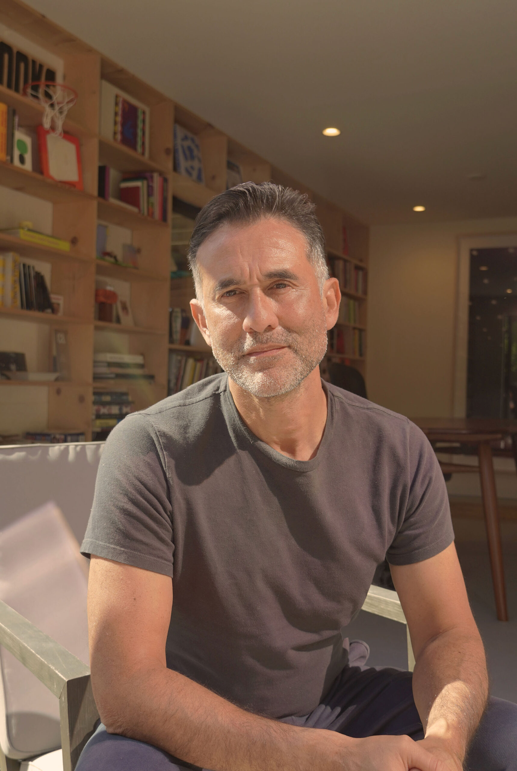
Chiu worked her way up from a role as a department assistant at Penguin Random House 15 years ago. Today, she’s known for her designs and illustrations on bestselling romance novels, including Emily Henry’s six-hit streak. Chip Kidd is an associate art director at Knopf Doubleday and about as famous as a book cover designer can be, having worked on everything from Jurassic Park to All the Pretty Horses to The Secret History. When he started out as an assistant at the imprint in the ’80s, he made $16,000 a year. (He is quick to note that his rent cost only $389). During a brief stint as a professor at the School of Visual Arts, Kidd vaguely remembers one student lurking in the back of the room: Corral. “He was okay, but [there were] no glimmers of the brilliance that he was going to become,” Kidd says. “To this day, I don’t know where he got that or who taught him that, but it really wasn’t me.” When I speak to Corral—who now runs an eponymous studio that works with clients like Jay Z and Mark Ronson, in addition to his post as the VP of Creative at Farrar, Straus and Giroux, which works with Sally Rooney, Rachel Cusk, and more—his slipping by Kidd’s notice quickly becomes understandable. “I was so incredibly intimidated by Chip, I think I spent more time not going to class than actually going,” he laughs.
Much has changed since Kidd outlined the industry for students like Corral in the ’90s. Here, Chipp, Chiu, and Corral offer a revealing look inside the changing world of book covers—and by extension, the constantly shifting intersection of art and commerce.
CULTURED: Let’s start with the first thing that you do when a project comes across your desk.
Chip Kidd: I would imagine that step one is the same for all of us.
Rodrigo Corral: I’d hope so. I’m going to assume yours is reading a brief and diving into a manuscript.
Kidd: Correct. I did some podcasts a couple of weeks ago, and I still get asked, “Do you read the book?” To which I say, “No, I just guess.”
Corral: You close your eyes and you point to the nearest font.
Sandra Chiu: I work a lot on rom-coms. So lately, I have not been reading a lot of it because they have really similar formulas. I read a couple of them when I first started working on them, but now they’re just so formulaic.
Corral: Interesting. How does that inform your designs then?
Chiu: The market has been so saturated with the specific look that I’ve been working on that it’s just like cranking things out, but at the very beginning it felt like I was doing something new. I’ve looked at your work and Chip’s work throughout the years, and it’s just so inspiring. I feel like I’m still trying to break out of the commercial sphere.
Corral: When you look at all the work that Chip has done over the years, the thing that inspired me the most is that each one looked like another person designed it. That’s the part that excites me—an opportunity to dive into someone’s imagination.
CULTURED: Chip, what are the biggest differences between the industry when you started and now?
Kidd: There’s a lot of differences, but the biggest one, and this dovetailed with Covid, is our budgets. I used to do things that you could never do now because of supply chain issues and the cost of paper and manufacturing.
Corral: Covid basically gave finance departments this card that they could hold, that they still wield, that printers are high premium and it’s really difficult to get press time. It’s becoming increasingly difficult to do special papers, special cutouts, things that they’ll say, “Oh, it gets ripped in transit, or it scuffs.” I imagine they have a list on their screen permanently of reasons why we can’t pursue those approaches.
On the flip side, sometimes out of limitations comes great results. I worked at Farrar, Straus & Giroux fresh out of school. It was so editorially driven that we didn’t even have a real marketing team in the early days. That became a superpower in knowing how to work with very little.
Chiu: Also, now we’re designing more for viewing online. Everything is just really big: Type has to be really big and colors have to be really poppy. It almost seems like how the image looks online is more important than what it physically looks like.
Corral: It actually came up twice this week—changes we could make to ensure these jackets pop on Amazon.
CULTURED: How much control would you say the author actually has over the book cover design? When are you like, “We’re going to have to overrule that note”?
Chiu: It depends on their contracts, but the ones I’ve worked with have some input but not total control. A lot of the time, they give specific feedback on what the characters should look like, but at the end of the day it’s usually sales and marketing. A lot of the time, the authors also have artists in mind.
Kidd: I’m in a situation right now where there’s this new author that we’ve acquired who has something of a good reputation and she specifically asked that I work on it. How do I say this without sounding like an asshole? We nailed it. Twice. Everybody in house was thrilled. And then it goes to the author. She was just like, “No, absolutely not.” You go back to the drawing board. And I nailed it again. Nope. It’s really frustrating. I think we give the authors too much power, but that’s just because of where my head is at today.
Corral: We all know that the ones that sell the most get to choose everything: their publicists, their jacket designer. How are we defining where we draw the line in allowing an author to reject a jacket? As the publishing house, we’re the experts, right?
Kidd: In this particular case that I’m in right now, I think the author is not working in their own best interest.
CULTURED: Have you ever seen a book where you thought, The success of this was totally thwarted by the cover? What do you guys think leads to that kind of misalignment?
Corral: Well, that’s the comedic part of our role sometimes. If a book doesn’t work, the first thing they’re gonna blame is the jacket. And they’ll say, “Well, let’s redo it in paperback.” Is that really the reason, or…
Kidd: Or maybe the book wasn’t really as good as you thought it was. Those I’ve had a lot of.
Corral: You said it, Chip.
Kidd: I sound so negative and bitchy in this interview.
Chiu: I’m actually working on a project now that I have to repackage. It’s a really good read, but the hardcover design just didn’t resonate with the target audience. It’s a comedic mystery thriller.
Kidd: That’s a hard line to walk—comedic thrillers. I can’t even think of an example.
CULTURED: How would you all define the big trends that you see again and again?
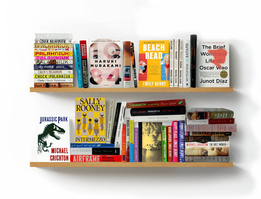
Chiu: Well, the illustrated covers for the romance category and the dark scene with hand-lettered, bright neon type for thrillers.
Kidd: A lot of hand-lettered or scribbled type for the past couple of years.
Corral: It does feel like a lot of designers think of themselves as illustrators as well. The publishing industry has that challenge where if they have someone on staff that can illustrate, great. They’re getting a two-for-one. But I just find it hard to believe that there are that many gifted illustrators in the book jacket space. Maybe my standards are too high, but there are just some jackets out there that I just look at and say, “Hmm, was that really the best choice for you to illustrate that? Or was it a financial decision?” That’s my turn to sound nasty, Chip.
Chiu: I guess for me, I am that staff illustrator.
Corral: Yeah, but you can illustrate. That’s the difference.
Chiu: With Covid, we’ve also just started looking online more for illustrators who constantly post on Instagram and we work a lot more with newer illustrators, not people who necessarily went to art school. That’s a fun thing.
CULTURED: Is there any myth about working in book cover design that you guys want to dispel here?
Corral: I love that you even think people think about it. I mean, I meet people at parties and they’re like, “Oh, wow, that’s actually a profession?”
CULTURED: Chip, you said that it’s the one design profession where you get a byline.
Kidd: In most areas of graphic design, the designer does not get credit. I think the reason I even have a career is because my name was attached to some amazing books that sold a lot. Getting credit for what you do is very, very important.
CULTURED: Do you have any specific notes you remember where you were like, That is just the craziest thing I’ve ever heard?
Kidd: Well, the latest one is, “Make it look like Crime and Punishment.”
CULTURED: What would you say is the best design you’ve seen this year?
Kidd: The hardest thing to do is a really great cover that’s [also] a bestseller. All Fours by Miranda July is a great cover designed by a woman named Helen Yentus. That hit the spot.
Corral: I’d plug Pablo Delcan as someone that does an incredible job of pushing at the edges of design. The [jacket] that comes to mind is called Absolution by science fiction writer Jeff VanderMeer. You look at it and you’re trying to understand it.
CULTURED: What about a situation where there is a different cover for different countries, like Sally Rooney’s Intermezzo, which you worked on, Rodrigo?
Corral: Sally has a massive following. She was described in one of our meetings as the Beyoncé of literature. The answer is simply that the publisher understands their audience really well. Sometimes we’ll run with the U.K. jacket, sometimes they’ll run with ours. Most of the time, they’re entirely different. Sometimes they’re like, “What are they thinking?” And a lot of times we’re like, “What are they thinking?” An album cover is universal, or it used to be anyway, and book publishing is the opposite.
CULTURED: Do you ever feel a competitive streak with the other covers?
Corral: No, but I do think, Did they read the same book I read?
CULTURED: I wanted to close with a question that Chip had posed to me, which was: Is the era of taking risks and running wild with book covers coming to a close?
Chiu: Well, trends are kind of cyclical.
Kidd: We used to take a lot more risks than we do now, because the market is tight. We’re still publishing as many books, but I look at some of my old stuff and there’s no way I’d get away with that now. But you’ve got to keep trying.
Corral: We’re not doing really crazy effects. But we’re still pushing. We’re doing printed cases and uncoated stock. It’s an opportunity to be on the lookout for projects where you can push for what seems like a crazy idea.
Kidd: Just for the record, I still love my job.


 in your life?

